Was Didi's delisting priced in? A dive into Chinese indexes and options

2021 has been a rough year for everybody around the world. Market-wise, it’s been a rough year for China.
Minimal to negative index gains have been a norm for China in the past year, most likely resulting from increased conflict between the US and other countries (stock market warfare), credit troubles (re: Evergrande exploding), and several large companies being ousted for fraud (Luckin coffee). Of course, there are copious facets which contribute to the slow decline, and naming them is not the exact purpose of this report.
The aim of this report is to examine the relationship between the the S&P 500, the VIX, the Hang Seng Index/VXI, and the volatility of the Hang Seng Index with the VXFXI. Additionally looking at some US listed Chinese company's option volume heading into the announcement date of DiDi's eventual delisting.
If you zoom out, the Hang Seng (HSI) has only mustered a 3% gain over the past 5 years, showing stalling growth in China’s largest companies. Complementary to this, the Shanghai Composite has risen a mere 15% in comparison to the S&P 500’s 109% gain in that same time span.
Do we know exactly why the second largest market is stalling? Not exactly, but we have a few ideas. We wrote about it, and you can read it here. This post covers the history of American Depositary Receipts (ADRs) and delisting of Chinese companies from US exchanges, and is an educational read.
These events have caused some problems for the Chinese markets, and the world-market’s trust in China. We’ve seen continued issues from China’s largest company, Alibaba, which has fallen more than 50% from its previous all time high in October 2020, surrounding controversy with the CEO and Houdini, Jack Ma. On top of that, the booming Chinese electric vehicle market from early 2021 has slowed into a flatline while comparative world electric vehicle companies reach all time highs. Such is the case with Tesla smashing ATH’s, and the world EV market rising 16% in the past year.
Surely, with such diminishing returns, investors could have foreseen this? Well, for that, let’s look to the options market, and see how people were betting.
Chinalysis
Onto the meat of the report, I will dive into a period of recent controversy: One of China’s largest companies, DiDi, China’s version of Uber, plans to pull their US-listed ADR from the market over ongoing tensions between China and the United States. Following the announcement, shares plunged 20% overnight, and are down roughly 30% since then.
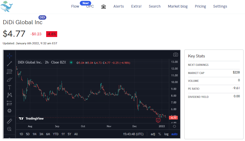
Though small in comparison to some of the other Chinese big guns, the DiDi delisting sheds light on current political tensions between our two countries, so how was the market responding to this?
Data
For this report, I looked at total market indices, volatility indices and US-listed Chinese equities data between the periods of March to December 2021.
For the sake of the report readability, I used the iShares China Large-Cap ETF (FXI) and CBOE’s China ETF Volatility Index (VXFXI). Moving forward, I will refer to the FXI as just the HSI as their movement patterns and exposure are extremely similar, as the FXI is meant to replicate the HSI’s movement.
So remember:
VIX = Cboe Volatility Index, it measures market volatility or the level of fear or stress in the stock market.
SPX: Standard and Poor (S&P) 500, which tracks top US 500 companies across 502 tickers.
HSI = China’s Dow Jones Index, 60 largest Chinese companies by market cap.
FXI = HSI index clone, it attempts to mimic the movement of the Hang Seng Index with Chinese constituents as an ETF.
VXFXI = FXI VIX, it measures the volatility of the FXI ETF, similar to how the VIX works.
My analyses focused mainly on the VXFXI (FXI/HSI volatility) and the VIX (S&P 500 volatility) for overall volatility. An important note is that, while these both track index volatility, they are not the same thing. The VIX calculates the volatility of SPX futures contracts, whereas the VXFXI calculates the volatility of the FXI ETF (US exposure to Hang Seng index) via implied volatility.
Show me the math!
The first part of this analysis begins with the period between September and December 2021. This period surrounds and encapsulates any potential insider or public news speculating on the Hang Seng, and if big news such as this was captured by any US investors speculating.
To start, checking the interaction between the 4 indices seemed to be appropriate. Using a Spearman R to derive the correlations, and a Pearson R for the rolling correlations, the results can be seen below.
A correlation is the strength of the relationship between the relative movements of two variables (ex. two stocks). We can determine the strength of this relationship by calculating the correlation coefficient. A high positive coefficient (ex. 0.75, 1.0) can be seen as a strong relationship, meaning they appear to move together. A high negative correlation (-0.75, -1.0) can be seen as an inverse relationship, meaning they appear to move separately from each other.
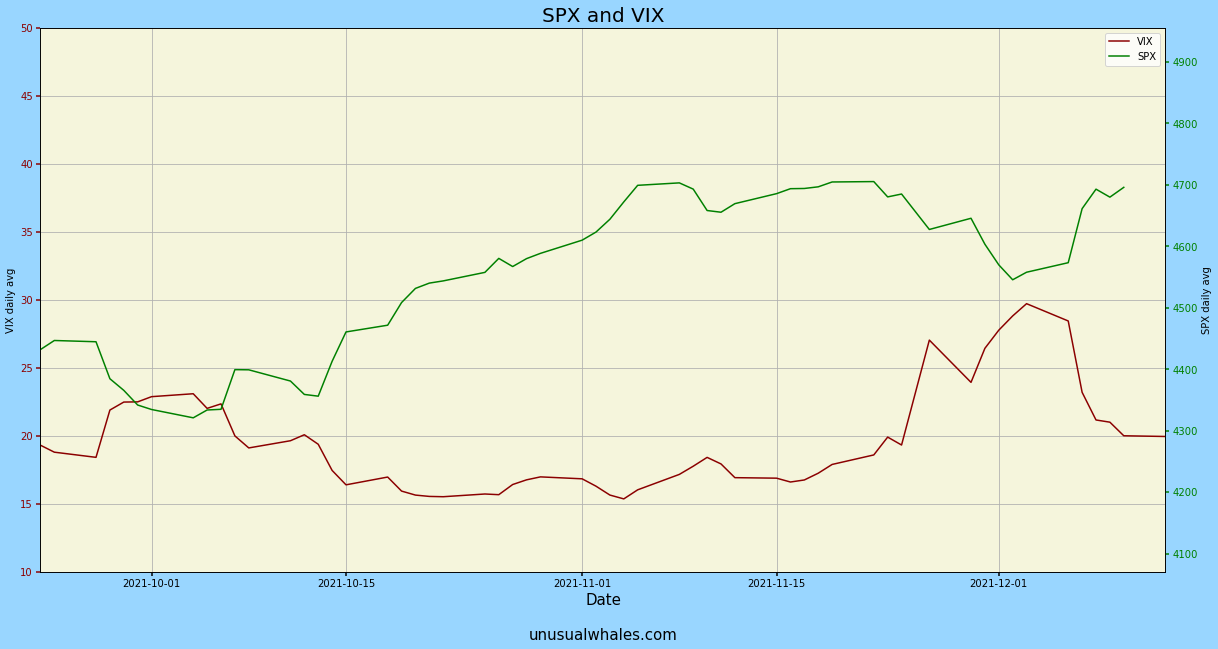
For example, the chart below would have a negative correlation. When one moves up, the other moves down, and you can see the VIX miming the movement of the SPX fairly well.

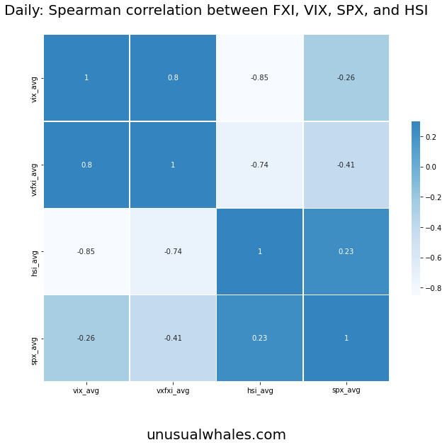
For the daily correlation, we can see an unusually large negative correlation between the VIX and the HSI (with a coefficient of -0.89). What this tells us is that, through this period, the VIX had an inverse relationship to what was going on in the HSI/FXI, potentially showing that investors were speculating on Chinese volatility affecting US markets. Due to the VIX being a “fear index” for future volatility, this association could be true.
The movement of the VIX/HSI is reinforced by the VXFXI having just over a -0.7 coefficient to the HSI/FXI through this period.
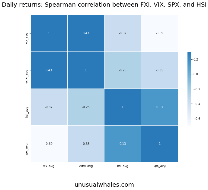
As for daily returns, this aligns with the previous research consensus interpretation VIX/SPX correlation of between -0.7 and -0.9, and helps reinforce that the research with a coefficient of -.69, just shy of the -.7 range of normality. The returns between the VIX and the VXFXI were weakly correlated at .43, but there isn’t much significance in that number.
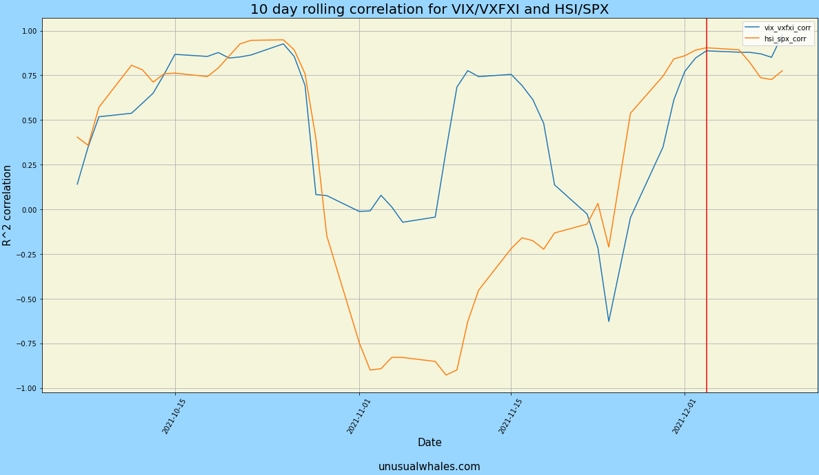
Let's Roll (rolling correlations)
The 10 day rolling correlation for the SPX/VXFXI and HSI/VIX showed promise as well, especially around the date of the DiDi delisting news.
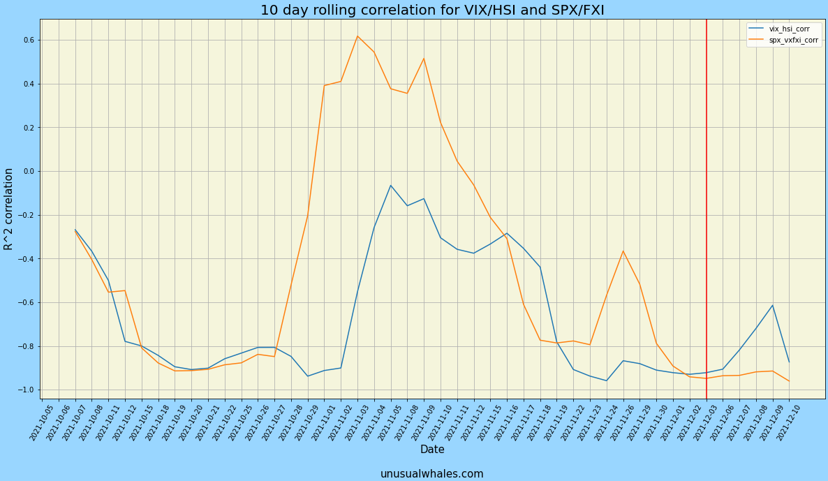
On December 3rd, the date of DiDi’s delisting announcement, the correlation of SPX/VXFXI and HSI/VIX was close to -1 at ~-.9, showing a nearly inverse relationship between the indices and volatility counterparts. This is what we want. When volatility rises, we should, theoretically see the indices fall. However, there was a period in late October into mid November where we see this trend reverse, especially for the VXFXI and the SPX.
However, when we check the rolling correlation of the SPX/VIX and HSI/VXFXI, we see a very different relationship.
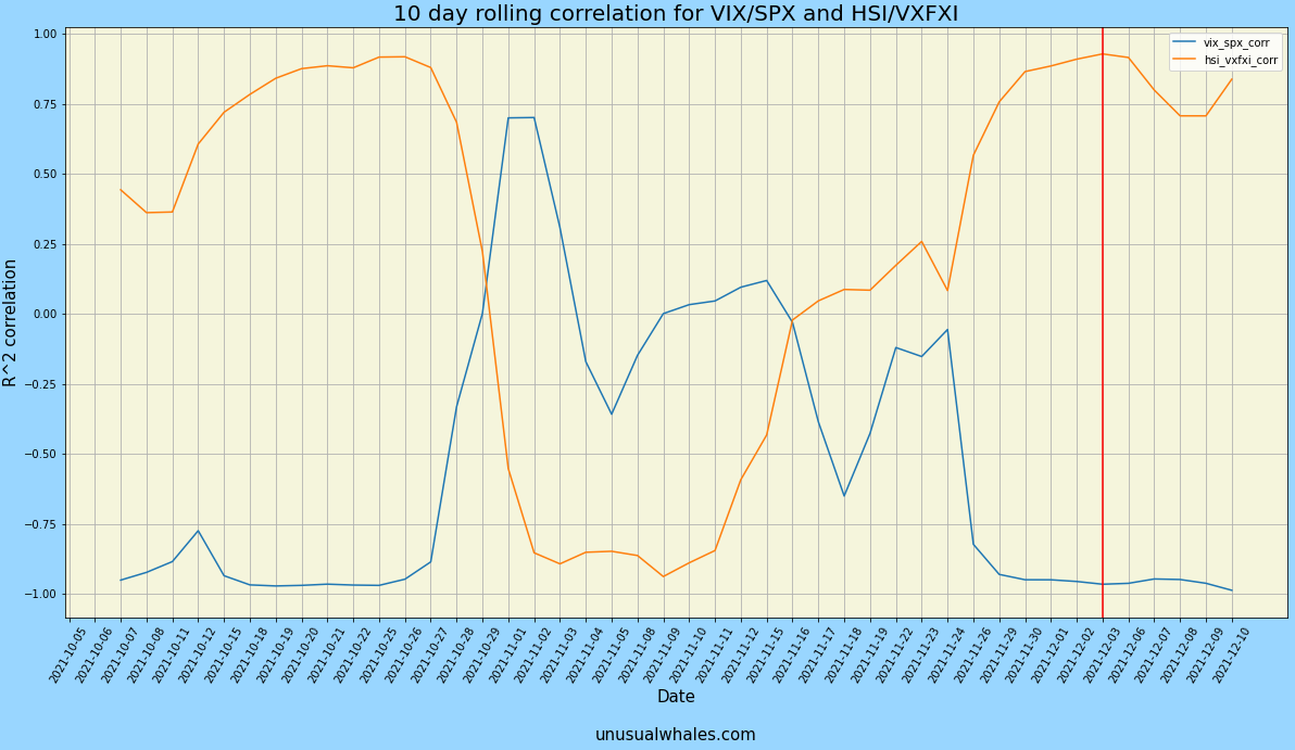
The SPX/VIX correlation was about as we thought, averaging at -0.53 through the period, which is fine that there was some divergence between the two, as the period had some bouts of volatility without SPX reaction. However, the HSI/VXFXI had weak correlation, averaging at 0.25 for the duration.
We see 2 instances where the HSI/VXFXI had high positive correlation for a period longer than what should be normal. What does this mean? The HSI/VXFXI were not moving against each other through these periods, and moved with each other. In simple terms, both the HSI and the VXFXI went up or down in tandem.
Why is this important? Because it shows there are periods that US investors are speculating on Chinese volatility on a consistent basis. This, in conjunction with the previous chart, shows a pattern of very similar movement between the VIX/VXFXI for the period with the VIX/HSI, and lets us know that there is continually volatility expected out of China in US equities. They are simply fading every rally, and expecting downward movement.
But how do these look together?
Price Action Breakdown
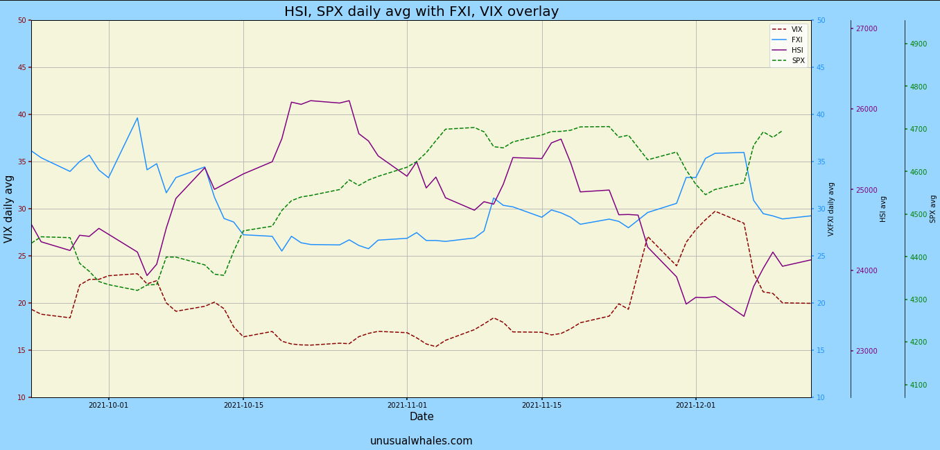
We can observe the price action on this chart. Admittedly, it is a bit jumbled, but we can see the VIX/SPX behaving normally, yet the HSI/VXFXI were behaving rather divergently from each other.
Separating the two regions shows a clearer picture of this relationship:

Where the VIX is following a rather close inverse relationship to the SPX, as would be expected, the HSI and VXFXI had no relative pattern to each other, which is noteworthy. One would assume, given similarities to the VIX/SPX that they would move opposite each other, but the math and visuals deem this to not be the case. Why is that?
The VXFXI calculates volatility based on the implied volatility of the FXI, and implied volatility is based on the options contracts of the VXI ETF itself. What this is telling us, is that, again, investors are speculating on future volatility coming out of China, fairly frequently associated with whenever the index itself rises.
Back to the VIX and SPX, we see movement replicated inversely between the two tickers, as what one would believe is normal to the market.
Lastly, as we’d expect, the 10 day rolling correlations to the VIX/VXFXI and SPX/HSI move in conjunction, and reinforce the thesis.
But, as options traders, we want to know how the options market responded to this.
I've got options
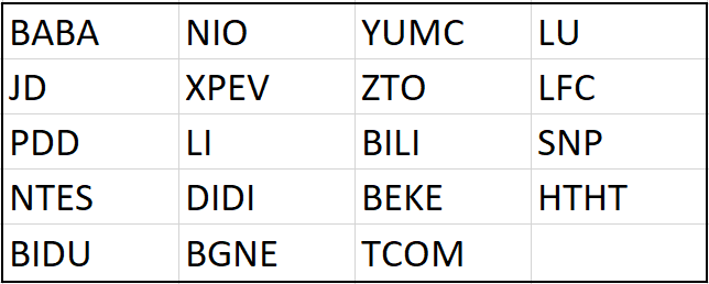
For analyzing the effects on US listed Chinese companies, I selected a basket of 20 tickers/total US listed Chinese companies, which is comparable to the ratio to evaluate the S&P 500/total US listed companies. On top of that, the HSI is functionally the Dow Jones of China, and is weighted by market cap. The tickers within the basket I created are simply the top 20 Chinese companies by market cap listed in the US. A ticker in the list was not optionable, and was removed from the data as such.
In the following charts, options volume is overlaid. What that means is that the different colored bars represent the total volume for calls and total volume for puts, separately, and not stacked on top of each other.
Why is this important? For readability, of course, but what else?
Well, it lets us know if the options market was attempting to price in these movements, at least from the perspective of volume. A real way to check this is by comparing ATM IV’s over the period, but data access to that is rather sparse, so we will have to use volume to get an understanding. From this basket, I took the total daily call volume and total daily put volume for each ticker and summated them separately to arrive at the results below.
Price Action Similarities

Looking at the options volume by day, We can see a big spike in call and put volume (> 1mm call volume) on October 7th. Nothing extremely notable on this, except for put volume increasing alongside, surpassing 500k total put volume on the day.
Again, why is this important?
Well, that day had the highest total call volume for our basket, and also the second highest put volume short of the Didi delisting day itself (Dec 3rd). On December 2nd, we can see a huge spike in total put volume traded, and only a slight tick upward in call volume from what seems normal.
On December 3rd, we can see the total daily put volume surpass total daily call volume, which, interestingly, was a local bottom for both of our indices, but the trend soon reversed after that as indices started rising.
How did the VIX and VXFXI respond during this period?

Despite the volatility correlations from earlier, we seem to only see the put volume increase on days where VIX leads the direction.
However, aren’t the ADR’s representative of the company in China? Correct, but they’re still US interpretations. Logically, this makes sense since these are Chinese tickers, but technically US traded stocks. Stocks listed on the US options market would better respond to their respective ADR’s than to their Chinese counterparts, but the instability should be reflected within the volatility of the FXI, since the FXI is mimed exposure.
But was the options market pricing this in, potentially?
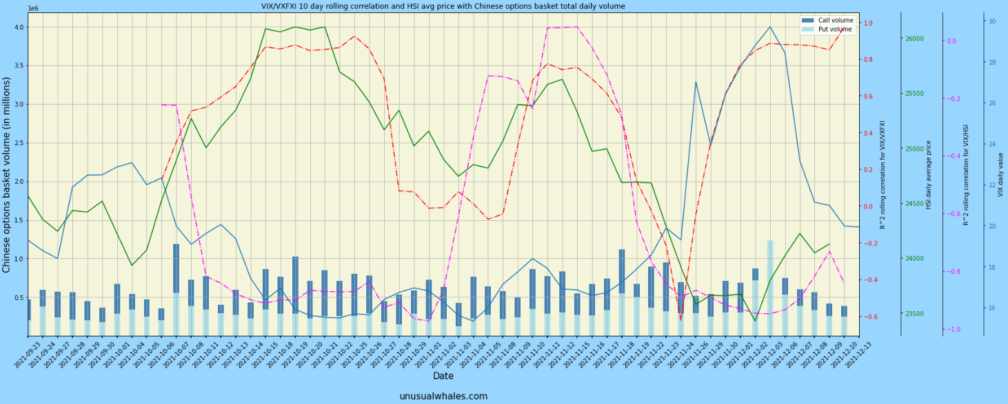
This is a complicated chart, I know. But let’s try to dig into this.
- The green line is the HSI daily share price
- The blue line is the VIX daily value
- The red dashed line is the correlation between the VIX and the VXFXI
- Close to +1 means they move together in same direction
- Close to -1 means they move in opposite directions
- The pink dashed line is the correlation between the VIX and the HSI
- Close to +1 means they move together in the same direction
- Close to -1 means they move in opposite directions
What is this chart telling us?
- The correlation between the VXFXI and the VIX follows the HSI price well for November, meaning when HSI price rises, volatility rises for both.
- This is reflected with the VIX/HSI correlation.
- VIX/HSI correlation in november showed strong positive movement between the two, and is seen with HSI and VIX values.
- In the period of late November, the correlation between the VIX and VXFXI drops to near -1, despite the VIX movement upwards (short term bearish movement from the SPX), even though the Chinese news had not been announced yet.
- The volume from the Chinese basket was not responding to movement in the HSI, despite the VIX seemingly responding.
- The movement of the VIX was not reflected truly in the SPX, but was reflected within the movement of the HSI.
What is this concluding? Is there anything we can tell from this?
Conclusions
Despite the analysis of US markets trying to price in Chinese volatility, the options market did little to reflect that change in terms of increased volume. We saw call and put volume spike the day before the DIDI announcement, but aside from that, the options market didn’t seem to reflect much movement.
In fact, I actually checked these metrics against other features in the flow that we had.
- Call volume
- Put volume
- Bullish premium
- Bearish premium
Unfortunately, these did not contain any lead either to the mysteries of the options market. There were no notable correlations (nothing > |.5|) to check from, and no windows which corresponded to any insight on a strategy from this. If there were more raw data to work with, such as individual contract pricing, expiration Implied Volatility, and specificity on what positions were long/short, we could perhaps paint a clearer picture of where the options market was positioning, but for now the results are mostly inconclusive, so for the time being, this myth is busted.
What is certain: there is a question mark around Chinese volatility, and it seems US investors are continually speculating on heightened Chinese volatility despite it not reflecting in the HSI. They're not buying the rallies in the Hang Seng, but fading them instead, and it shows.
Why should investors care?
Well, it shows there is suspected volatility in the future, so we might want to be careful about being turbo long on Chinese tickers.
US indices have had one of their best YoY’s to date, despite China’s markets being flat. There is a definitive risk associated with China right now due to some economic instability and market warfare, but the US based ADRs don’t seem to buy it, at least on a short-to-medium-dated scale.
While this may not be a true 1:1 comparison of volatility and index performance between the US and China, there are data constraints which made further analysis complicated. Maybe that’s in the cards for the future, though…
Thank you all for reading this. My name is falcon, and you can find me on twitter @falcon_fintwit. If you have any questions about this analysis, or anything else you'd like to see answered, feel free to DM me there. I'd love to chat further.